We’ve been seeing a lot of this lately, so I felt it was time to talk about it.
Your homepage is built to introduce your brand. It’s designed to show a little bit of everything – services, about, maybe a blog feed, a few awards, a footer with 9 links… home pages are informative.
But informative ≠ effective
Especially when someone just clicked on a paid ad with a very specific intent.
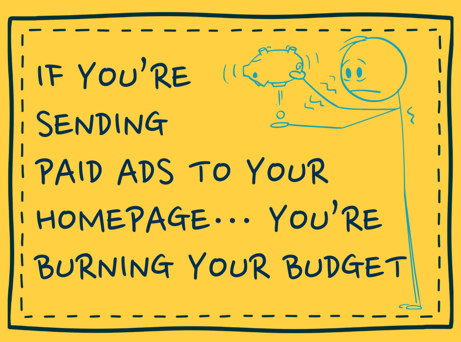
When ad traffic lands on your homepage, here’s what happens:
- There’s no clear CTA that matches the ad
- Visitors get overwhelmed by options
- People scroll without direction or bounce completely
Your homepage gives them a buffet of options. What they really needed was a clear next step.
Send Traffic to a Focused Offer Page
Think of your ad like a warm handoff or a digital handshake.
The offer page is the follow-up that says: “Hey, here’s exactly what you need.”
A high-converting offer page should have:
- A direct headline that matches the ad
- One offer, not three
- A single CTA (Book a call, Grab the guide, Start now)
- Zero distractions – no menus, no sidebars, no dead ends
This isn’t about tricking people. It’s about helping them make one good decision… a decision they already showed interest in when they clicked!
You Paid for the Click. Make It Count.
Not only is an offer page better for your customer; it’s putting your money to good use.
You’re already investing in paid traffic. Let’s make that traffic land somewhere with a point.
Offer pages work because they respect the user’s attention, match the message to the moment and drive focused action (not window shopping).
Having trouble getting your ads to convert? Book a free consultation and let us help you out!