Why We Sometimes Run “Ugly” Ads On Purpose
There’s a moment in almost every campaign where things split.
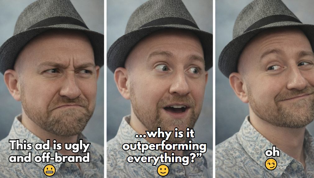
You launch ads that should work.
They’re clean. On-brand. Everyone signs off.
They look like what a “good ad” is supposed to look like.
And then… nothing.
Clicks are low. Engagement is flat. Conversions are inconsistent or just not there.
At the same time, some version you made almost as a backup…
a little rougher, maybe not perfectly on-brand… starts outperforming everything.
That one gets attention.
That one gets clicks.
That one actually moves things forward.
After you see that happen enough times, it stops being surprising.
You start realizing there’s something deeper going on.
We’ll show you some examples of high performing ads we’ve run for clients AND ourselves over the years. . . on the mainstream platforms for lead generation.
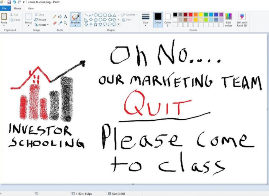
We didn’t actually “Quit”. . .but maybe took a day off for this one
When Brooklyn, one of our preferred content creators, was battling a cold and had to postpone the production video, we decided to go guerilla with it!
Not ugly, just unpolished! It turns out that Peter’s selfie-style in-the-field organic video was just what we needed to slip into the already well-performing adset

This was NOT an ad for gambling! But it was a pattern disruption – for RIAs to NOT gamble with their customer’s data!
No words. We made this one before “the talkies” came out.

How to stand out from a sea of wholesalers and commercial buyers? With PATTERN DISRUPTION!
The real issue isn’t quality
Inside a business, everything leans toward control.
You want consistency. You want things to look right.
You want your brand to feel cohesive everywhere it shows up.
That all makes sense.
But the environment your ads live in doesn’t care about that.
People aren’t scrolling their feed analyzing branding.
They’re not thinking about fonts or color systems.
They’re moving fast.
Filtering aggressively.
Ignoring almost everything.
So when your ad looks exactly like what they expect an ad to look like…
it gets skipped.
Not because it’s bad.
Because it’s familiar.
Attention is the constraint
Before anything else happens… before a click, before a conversion…
you have to earn attention.
And that’s where most campaigns fall apart.
The thing that wins in a crowded feed isn’t always the most polished.
It’s the thing that interrupts the pattern just enough.
Sometimes that’s:
- A visual that feels slightly off
- Copy that sounds like a real person instead of a brand
- A format that doesn’t follow the usual structure
It doesn’t have to be dramatic.
It just has to create a pause.
That pause is everything.
No pause means no attention.
No attention means nothing else matters, no matter how good the offer is.
Why polished ads disappear
The more polished something is, the more it tends to follow patterns people have already seen.
Clean layouts.
Balanced design.
Safe structure.
Internally, that feels right.
Externally, it blends in.
People recognize it instantly as “another ad” and move on without even thinking about it.
That’s why a lot of well-designed campaigns quietly underperform.
They’re not wrong… they’re just invisible.
Why a little imperfection works
When something feels a little less polished, it changes how people react to it.
It feels closer to real communication.
Less filtered.
More human.
It doesn’t immediately trigger that “this is an ad, ignore it” response.
Again, this isn’t about making bad creative.
It’s about removing just enough polish so it doesn’t feel like everything else in the feed.
That small shift is often what earns the attention you need to even have a shot.
Where this gets uncomfortable
This is usually where teams struggle.
You show that the rougher version is outperforming…
and the natural instinct is to clean it up.
Make it more on-brand.
Make it look better.
Make it feel “right.”
And then performance drops.
Because now it looks like everything else again.
So the real decision becomes:
Are we optimizing for internal comfort…
or external results?
Those don’t always line up.
How we approach it
This isn’t about preferring ugly ads.
It’s about removing assumptions.
We don’t guess which version will work.
We test it.
Run the clean, fully on-brand version.
Run the more disruptive, slightly off version.
Let the market decide.
No opinions to defend. No ego tied to one direction.
Just outcomes.
What you start to notice
Over time, a pattern shows up.
The ads that perform best are rarely the ones you would have picked at the start.
They might feel a little uncomfortable.
They might break small internal rules.
They might not look like the “perfect” version of your brand.
But they work.
And in a performance environment, that’s the only metric that actually matters.
That doesn’t mean brand doesn’t matter.
It just means brand and performance aren’t always solving the same problem at the same time.
Brand builds trust over time.
Performance captures attention right now.
The better question
Instead of asking “does this look right,”
ask “does this earn attention?”
Because if it doesn’t, nothing else downstream matters anyway.
The takeaway
Polished creative has its place.
It builds consistency. It reinforces identity. It supports long-term growth.
But in a feed where everything is competing for attention…
predictable is a liability.
Sometimes the best move is running the version that feels a little off.
Not as a compromise.
As a strategy.
What we are leaning into now?
More pattern disruption. These breakout styles are particular great for our founder-lead organizations, who don’t necessarily want to get in front of the camera.