You spent time crafting the perfect ad. The headline hooks. The offer is solid. You hit publish and then… nothing.
No clicks. No leads. No momentum.
If that’s happened to you, you’re not alone and it’s not just a creative problem. It’s a problem routed in something I love to talk about… psychology.
In a world of media overload and instant gratification, our brains have become wired to avoid confusion, overload, or anything that doesn’t immediately feel relevant. This may be why your audience is ignoring your marketing… so let’s talk about how to fix it without a complete upheaval of your entire strategy.
1. Decision Fatigue Is Real
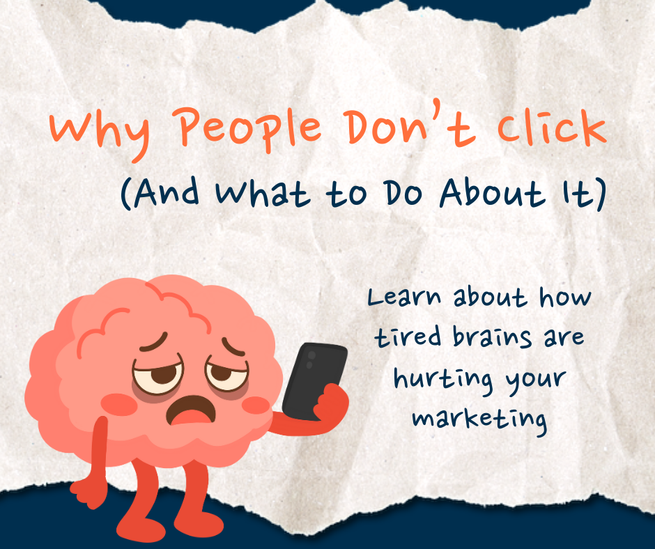
Have you ever been asked what you want for dinner and your mind just goes blank? You’re hungry, but you brain it tired. The wheels in your head feel like they just can’t turn anymore. That’s decision fatigue! We’re all bombarded with choices every day. The average person makes over 35,000 decisions daily — from what to eat to what to click.
If your landing page, email, or ad presents too many options, the brain short-circuits. It’s easier to do nothing than to pick something.
What it looks like:
- Menus with 10+ links
- Pages with 3+ CTAs
- Overloaded visuals fighting for attention
What to do instead:
- Choose one clear objective per page or asset
- Use visual hierarchy — big headlines, simple subheads, one button
- Remove distractions. Less is more when you want action.
2. Call-to-Action Blindness
People tune out what they see too often, especially if it looks generic or expected. When an ad looks like every other one they’ve already scrolled past, it fades into the background like noise.
“Click Here” and “Learn More” used to work. Now? They feel like wallpaper.
What it looks like:
- Buttons that blend into your background
- Vague or passive CTA copy
- CTAs buried beneath long paragraphs
What to do instead:
- Make your Call-to-Action (CTA) buttons pop visually with contrast
- Use value-driven language: “Get My Plan,” “See How It Works,” “Claim My Audit”
- Keep your CTAs above the fold and repeat where it feels natural
3. No Emotional Hook
We like to think we make rational and calculated decisions but most of the time, emotion leads and logic follows.
If your ad or page leads with cold features or technical jargon, you’re skipping the part that actually drives action.
What it looks like:
- Ads that talk about your product but doesn’t related to the reader’s problem your product is solving
- Headlines that don’t connect with how your audience feels
What to do instead:
- Use empathetic questions: “Feeling stuck with marketing?” “Wasting money on ads that don’t convert?”
- Paint a clear before/after: What pain are you solving? What outcome can they expect?
- Then bring in the logic – proof points, testimonials, stats
4. Cognitive Overload
“Cognitive” is just a fancy way of saying “how we think”. If someone lands on your site and sees a wall of text, their brain says, “Nope.”
The more effort it takes to read or understand your offer, the more likely people are to bounce.
What it looks like:
- Dense paragraphs
- Complex words or insider lingo
- Long explanations before the payoff
What to do instead:
- Like Michael Scott says on The Office… “Explain it to me like I’m five”. When it comes to your message, aim for an 8th-grade reading level. Not because your audience isn’t smart, but because clarity wins. If they have to work to understand it, they probably won’t.
- Organize using short paragraphs, bullets, and subheadings
- Make your offer obvious in 5 seconds or less
5. Irrelevant Visuals
Images and design are powerful. But if they don’t support your message, they’re just decoration… or worse, a distraction.
What it looks like:
- Generic stock photos or AI slop
- Creative images that doesn’t relate to your CTA
- Design that pulls attention away from the message
What to do instead:
- Use images that reinforce action or emotion
- Make sure your layout guides the eye to the next step
- Keep visuals simple and purposeful
The Bottom Line
If people aren’t clicking, it doesn’t mean your product or service is bad. It means your marketing may need a tune-up that’s rooted in how people actually think.
By reducing mental friction, creating emotional clarity, and guiding action with intention, you turn casual browsers into real leads.
Clicks aren’t magic. They’re behavior… and behavior can be shaped!
Need Direction?
If you’re not sure where to start or what to fix, our Five Minute Marketing Plan is designed to give you clarity.
Let’s stop guessing and start getting results.